

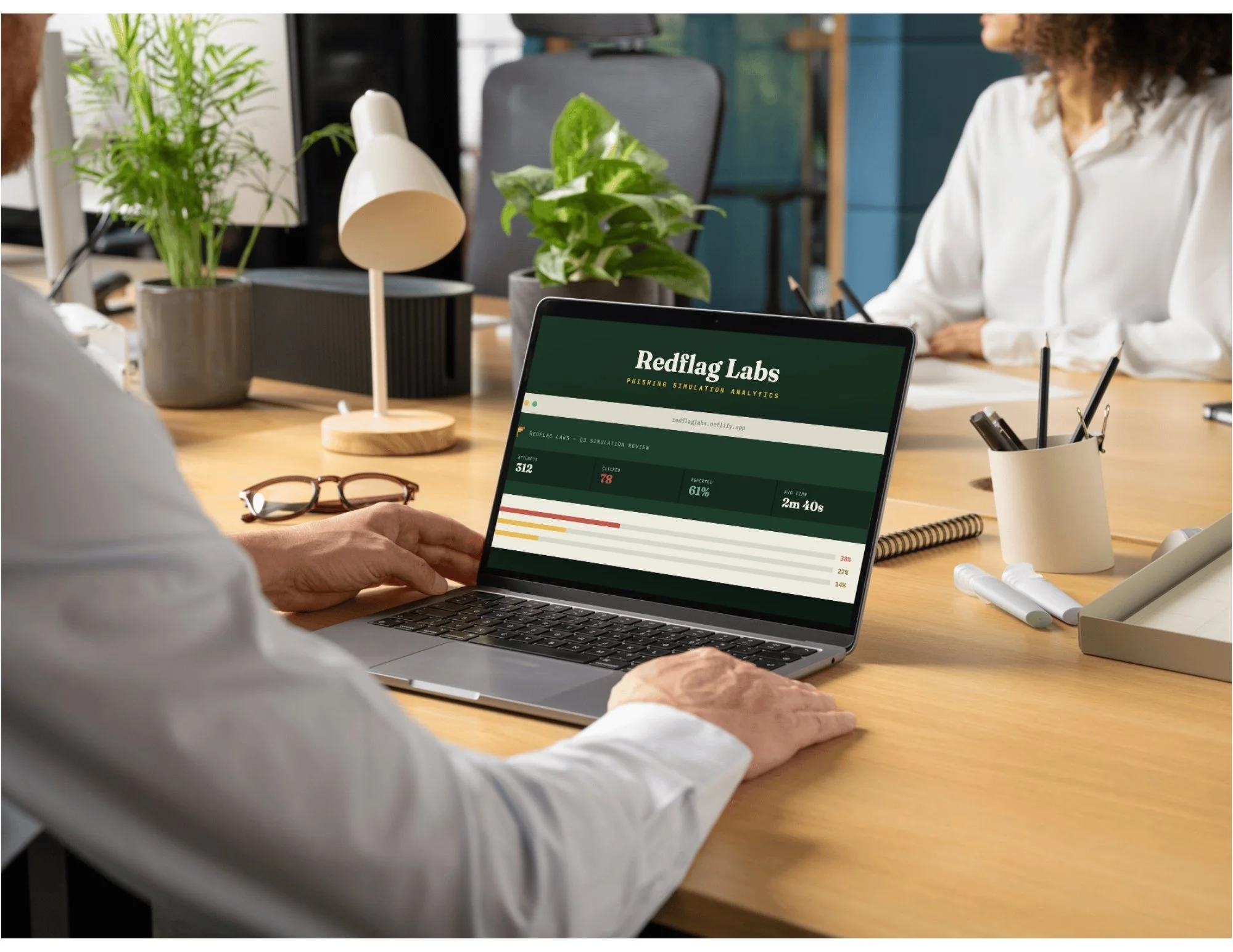
Redflag Labs: Reading the Pattern Behind the Click
A concept dashboard for security and L&D teams who get a phishing simulation report every quarter and still can’t tell who needs help. Admins upload the quarter’s results and see them broken out by department, employee, and the kind of email that worked. An AI mentor reads the data on demand and points toward which teams need which fix, sorted by what fooled people rather than how many of them clicked.
Audience: Security teams running phishing simulations, and the L&D partners who have to build the follow-up training (concept scenario)
Responsibilities: Data taxonomy design (scenario categorization by pretext and lure type), instructional design, dashboard UX, AI prompt design
Tools Used: Claude, Claude Design, API Logic, Google Docs
The Problem
Most simulation platforms report whether someone clicked. Rarely why, how many times, or what kind of email got them. So the follow-up training is generic: the same module for the person who fell for a fake IT password reset and the person who fell for a fake executive wire request. Different vulnerabilities, same fix, which is really no fix at all. Untangling that by hand means sorting results by department and scenario in a spreadsheet before you can even see who needs what.
The Key Decision
Most platforms sort by outcome: clicked, didn’t click. I sorted by pretext instead. A fake IT password reset works on someone who defers to internal authority. A fake executive wire request works on someone who feels urgency from above. Same click in the report, different failure, and they don’t need the same training.
Building that taxonomy was the real work. Deciding which lure types were distinct enough to justify separate follow-up was harder than building the dashboard, and it’s the part that determines whether the output is useful to whoever has to design the training.
Working with The AI Mentor
The mentor runs on demand, any time an admin wants a read on the current data, instead of waiting on a scheduled report. That’s what makes role-targeted recommendations possible: rather than one phishing-defense module for the whole company, the summary points toward which teams need which fix.
It also lied to me. An early version reported that most employees responded appropriately while the underlying data showed 44 of 50 had clicked at least once. It had summarized the tone of the data instead of the numbers in it. I had to require it to cite the counts it was drawing from, so a claim about “most employees” had to name the number behind it. Catching that mismatch was as much a part of the design work as the layout. A summary that sounds reasonable and is wrong is worse than no summary, because nobody checks it.
Reflection
The summary that used to take the most judgment now runs in seconds, which is the part I didn’t expect. Not replacing the reviewer’s call, just getting them to a defensible starting point so their time goes toward deciding what to do about the data instead of finding it.
Two things I’d change. The mentor recommends a category, not a course, because it has no idea what training actually exists to assign. And one quarter of data can’t tell you whether anyone improved. The population I’d most want to see is repeat clickers across quarters, and this version can’t show them.